


BIC Construction:
– A CASESTUDY –
BRAND DESIGN + IDENTITY
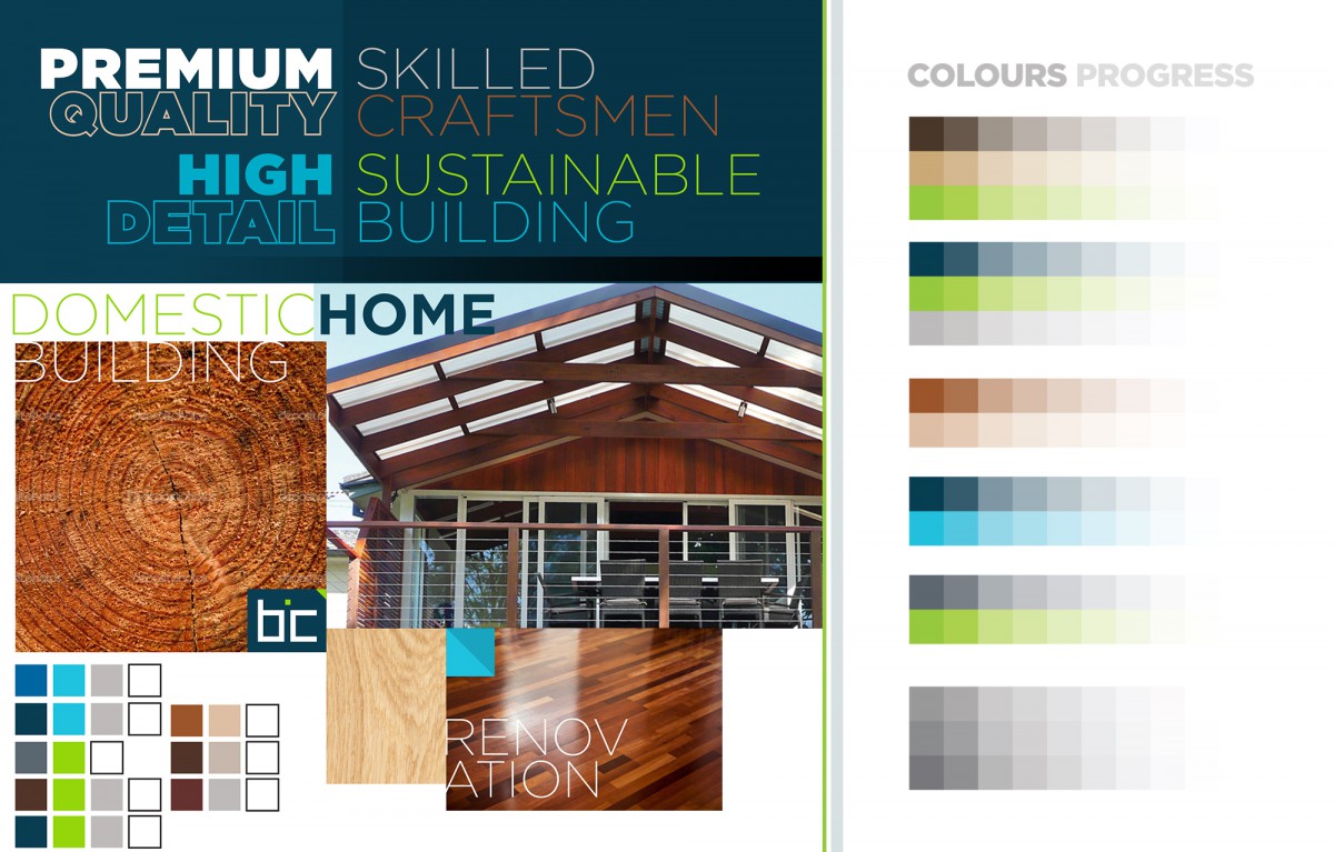
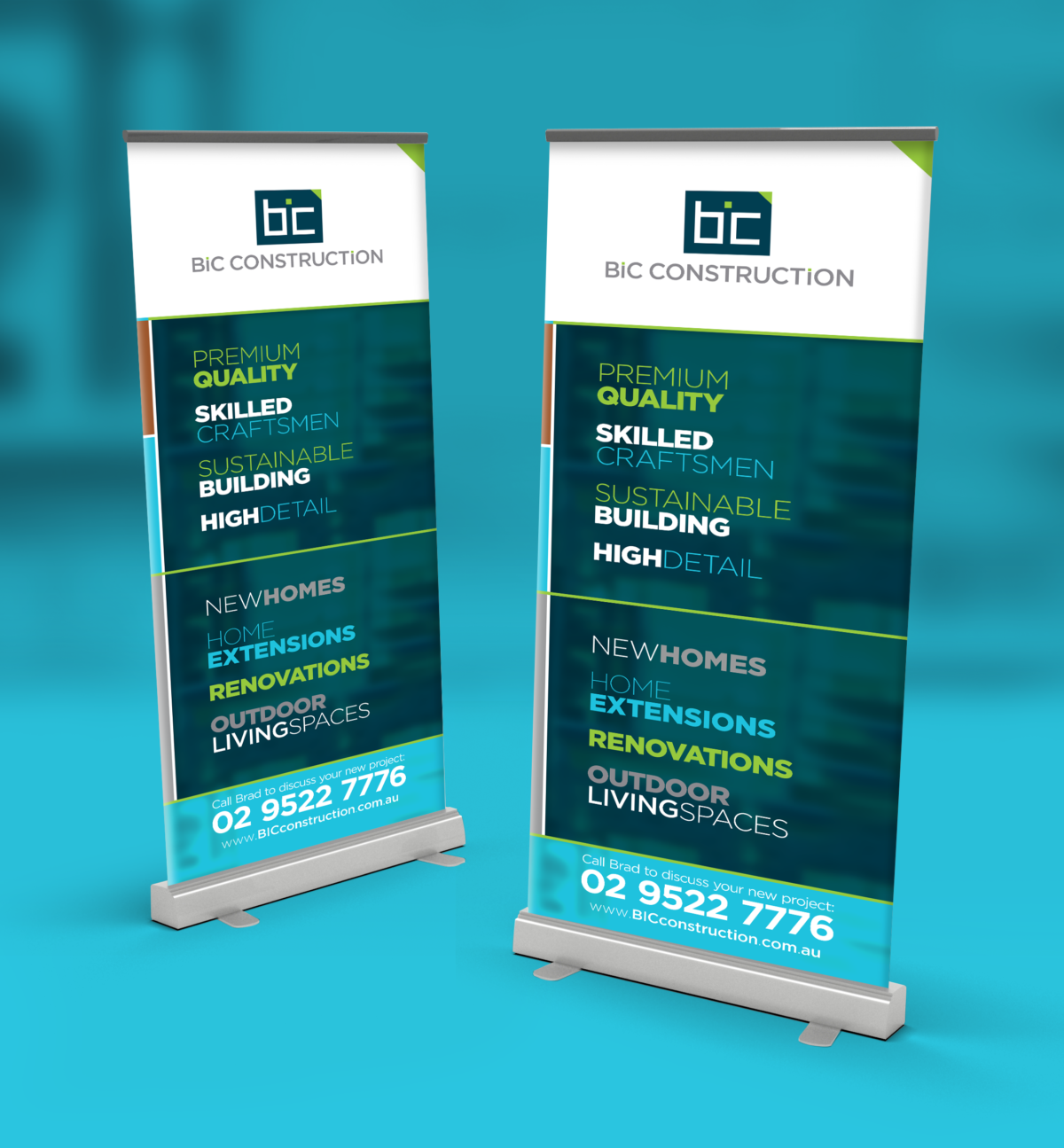
A company name change prompted the owner to approach S2 Creative to represent a new direction for the construction business. The positioning of the company and new identity was to reflect their capability to work closely with architects and designers on high end projects that require a more refined approach. The level at which BIC were operating saw the use of a dark, more corporate blue, accentuated with a vibrant lime – making reference to their determined priority of sustainability and eco-sensitive efficiency in their projects.
About BIC Construction
BIC Construction create custom designed renovations, extensions and first floor additions in association with architects and home owners. Their work is characterised by attention to detail, innovative materials and results that stay true to the character and quality of the original home.
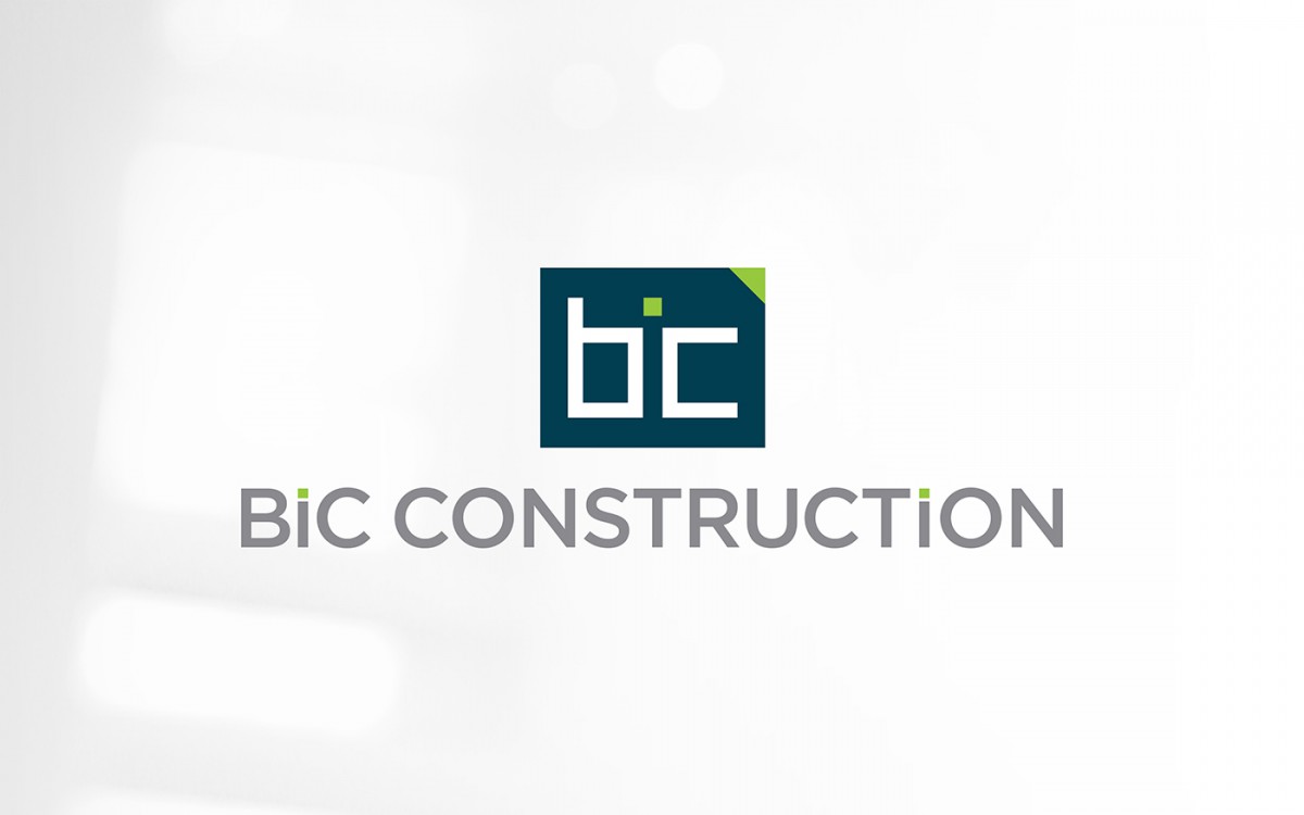
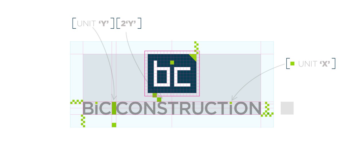
To our way of thinking, a cliché logo equals pedestrian company. The solution for BIC was based around the concept of ‘simple and clever’ – Our aim was to deliver a clever logo mark, and therefore communicate BIC’s unique approach. We developed a geometric logo mark using an optical illusion (there is no actual ‘i’) to describe the acronym of BIC. The client did have an initial uncertainty whether this approach would connect effectively. We reassured him that the target market of designers & architects would ‘get it’ which ultimately was the case from feedback received.
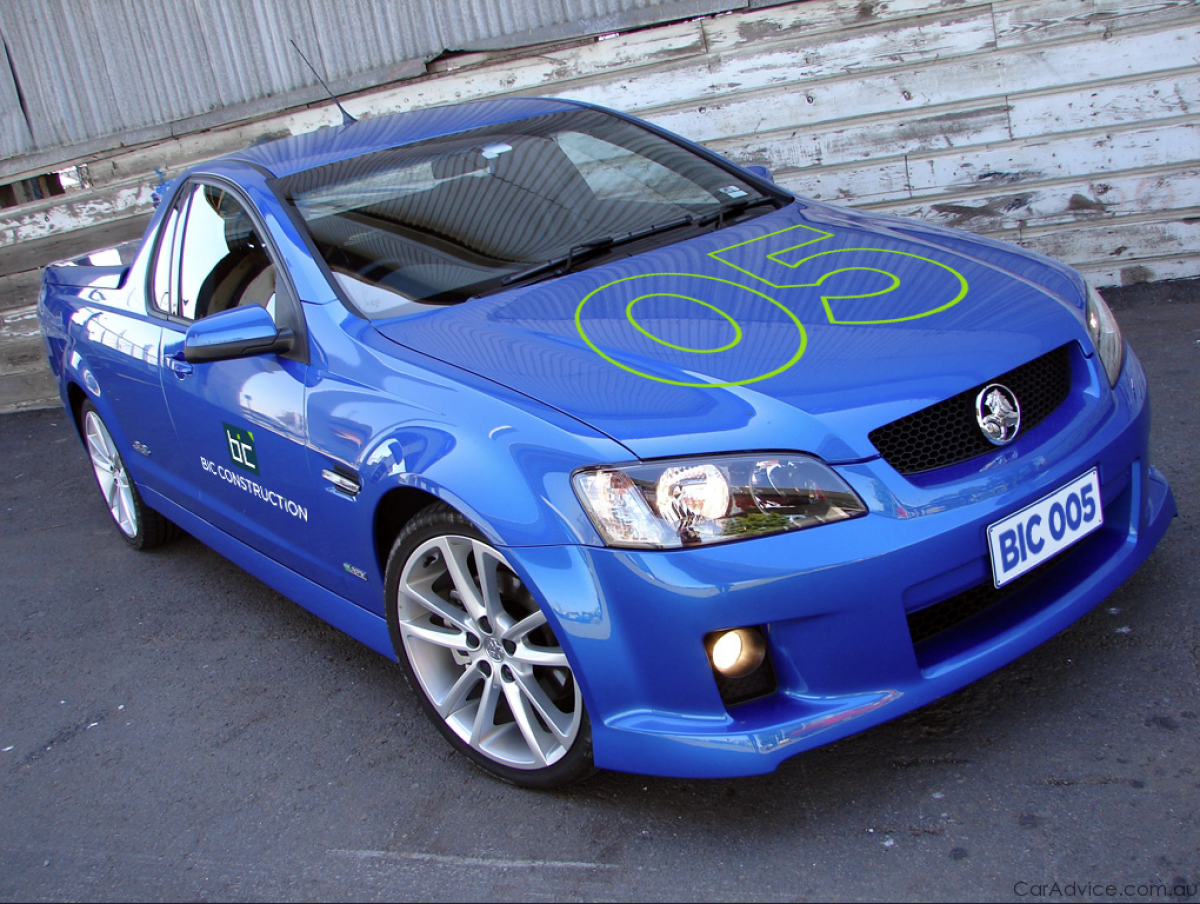
Our aim was to represent Mr. Chapman and BIC Construction as the skilled craftsmen they are, offering a superior build, fine detail and efficient, fluid work sites. Our branding work for BIC Construction also extended in the digital which comprised of a fully responsive Website and facebook presence.
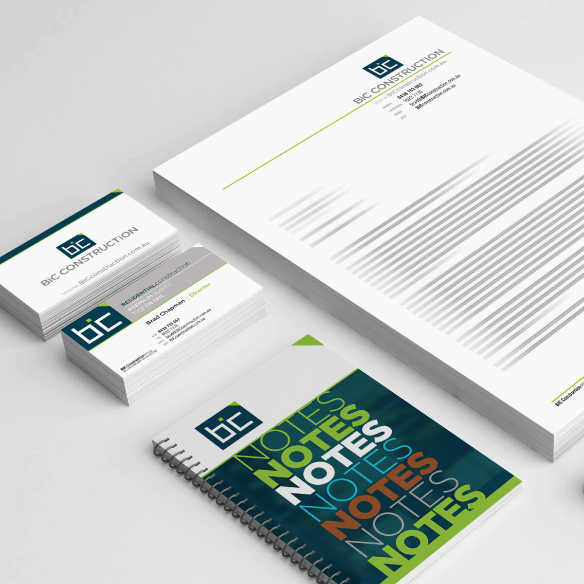
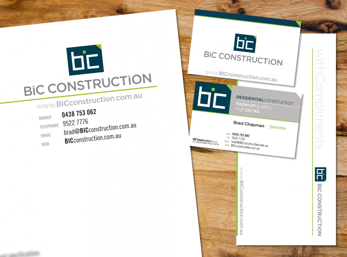
A complete stationery suite was also designed for BIC Construction as part of the rebrand including: Letterheads, Facsimile header, Quote standards, Business Cards, With Compliments slips, Notebook and Envelopes.
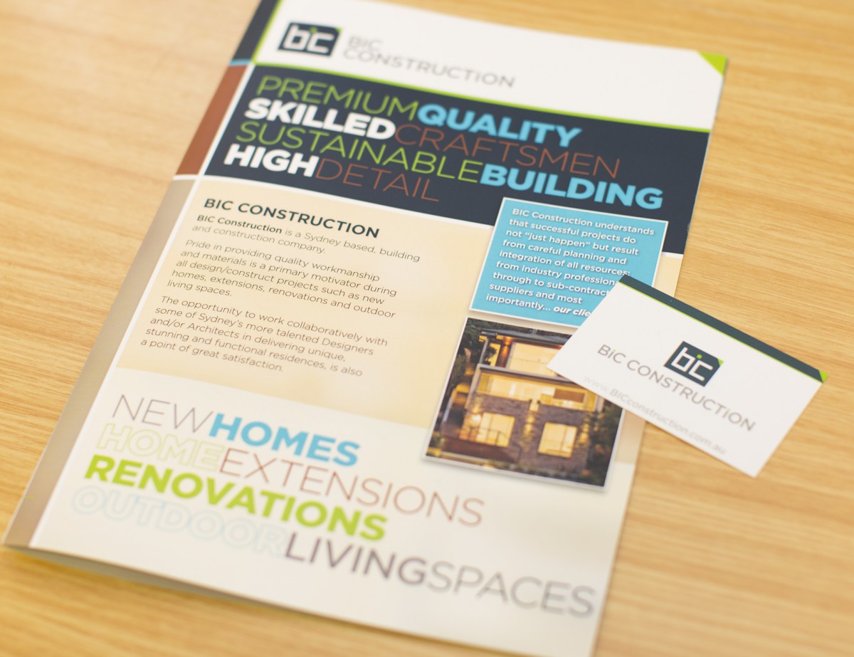
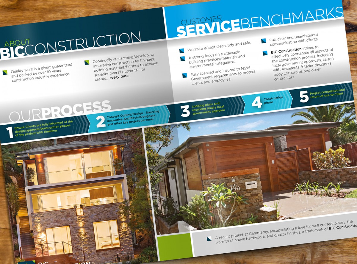
As part of the Rebranding of BIC Construction, we developed a 4pp Brochure to build awareness with Architects and Building designers. Printed on heavier card stock and matt cello glaze finish, the piece comes across as a substantial offering with the appropriate feel for the specialist construction company.
- January 1, 2015
- Case Studies