
BIC Construction
IDENTITY + BRANDING
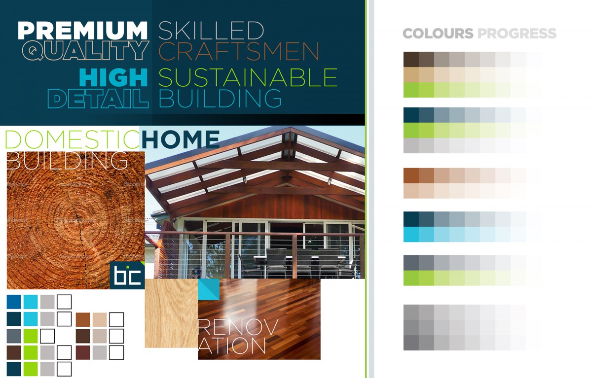
A company name change prompted the owner to approach S2 Creative to represent a new direction for the construction business. BIC Construction create custom designed renovations, extensions and first floor additions in association with architects and home owners. Their work is characterised by attention to detail, innovative materials and results that stay true to the character and quality of the original home.
OUR AIM:
The positioning of the company (and new identity) was to appeal to architects and designers as this was ideally their preferred kind of work. The bold icon reversed from a dark blue, highlighted with a vibrant lime – made reference to their core values of sustainability and eco-sensitive projects.
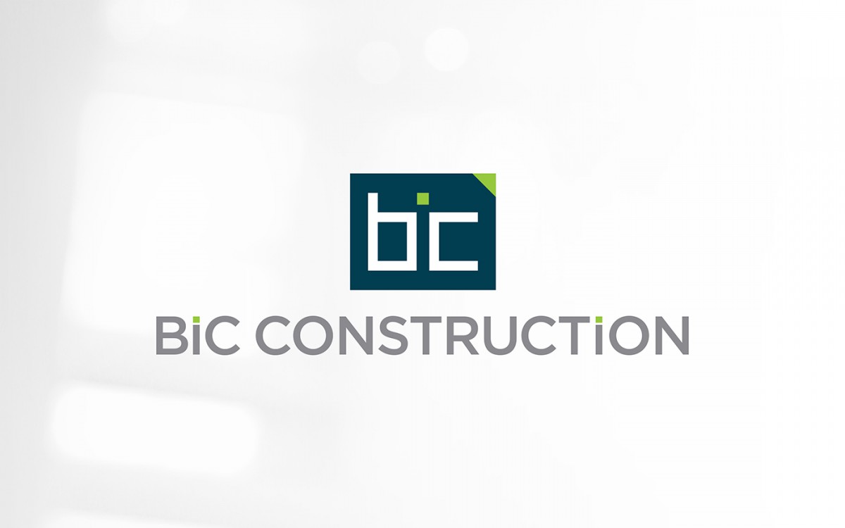
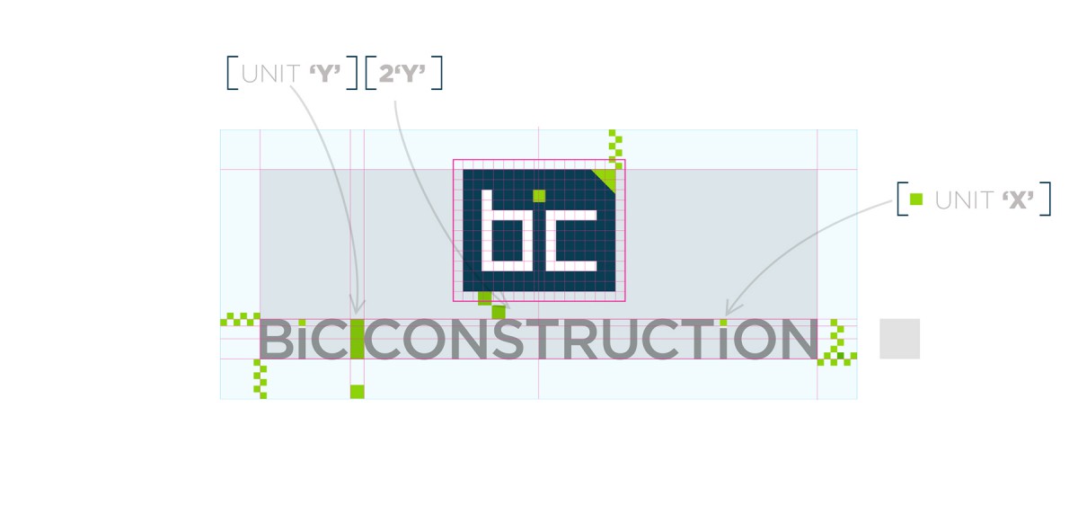
To our way of thinking, a ordinary logo communicates an ordinary company. The solution for BIC was based around the concept of ‘simple and clever’ – Our aim was to represent BIC’s unique approach through a unique Logo Mark. We developed a geometric logo mark playing on the optical illusion (the ‘i’ is represented in the negative space of the icon) to describe the acronym of BIC.
THE RESULT:
The client did have an initial reservations, though the new branding was well received with his target market of designers & architects. A business owner of any profession smart enough to understand what the right logo and branding can mean to their business will always standout in the marketplace, irrespective of competition to have an edge.
As with any branding project, we developed the extended family of logo lockups for consistent brand integrity and sensitive to print limitations.
See their high quality work here
DELIVERABLES FOR THIS PROJECT:
- April 13, 2015
- Branding
- Look & Feel
- Logo