Excel Physiotherapy:
– A CASESTUDY –
BRAND DESIGN, PRINT COLLATERAL + PHOTOGRAPHY
S2 Creative were engaged to develop branding, look and feel, print collateral and signage for a Wellness Centre that was under construction at the time. The concept was to offer a variety of services under the wellness banner including:
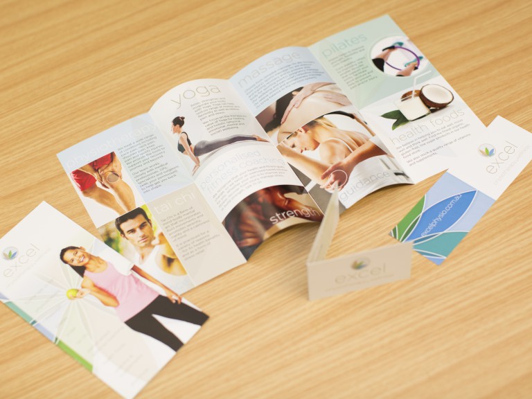
Physiotherapy – The owner’s primary focus, Massage, Pilates, Yoga, Tai Chi, Personalised exercise coaching, Health foods and Vitamins/supplements
A LOGO IN DEVELOPMENT
The client presented to us a concept logo that was in early development. A somewhat generic ‘running stick-figure’ style that can be all too familiar in the health and wellness industry. We felt the concept of bringing together of all of these usually separate disciplines required a more unique solution to encapsulate an overall ‘wellness’ message. The concept was developed around the Body, Mind, Spirit theme – more holistic in offering.
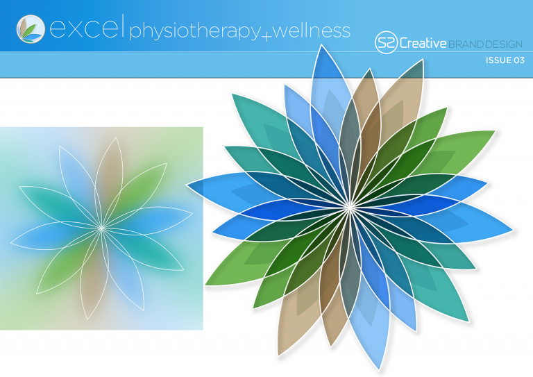
We developed various solutions including naming options over the course of the creative concept phase. Lotus based shapes seemed to be a good fit given the variety of services that the client wanted to offer which is ultimately what became the final icon.
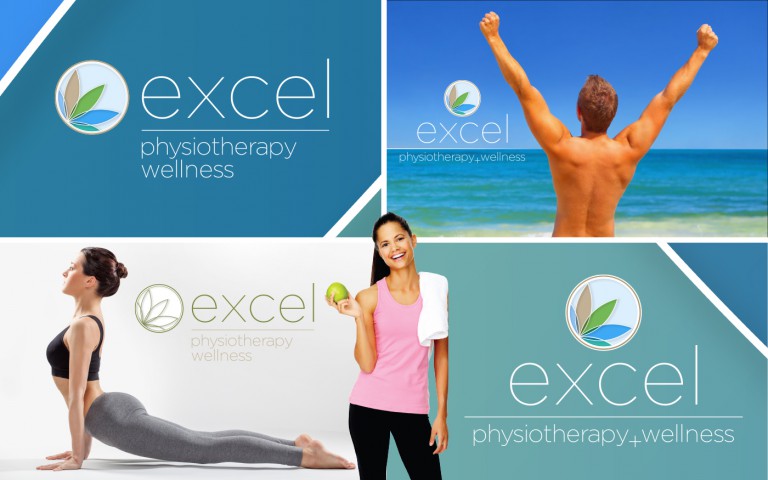
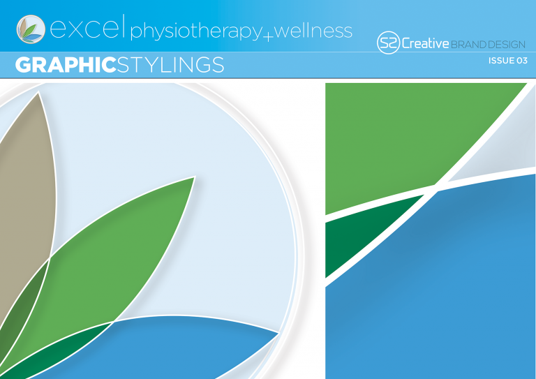
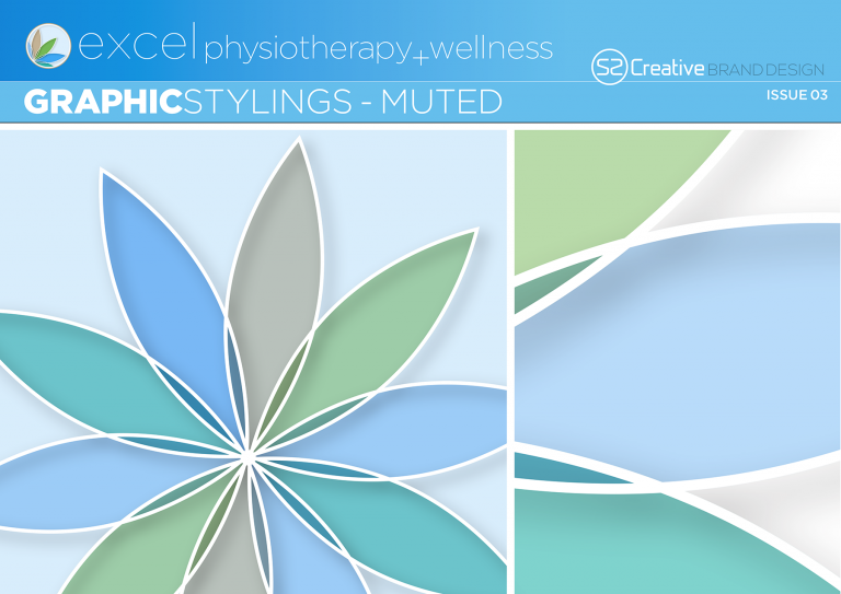
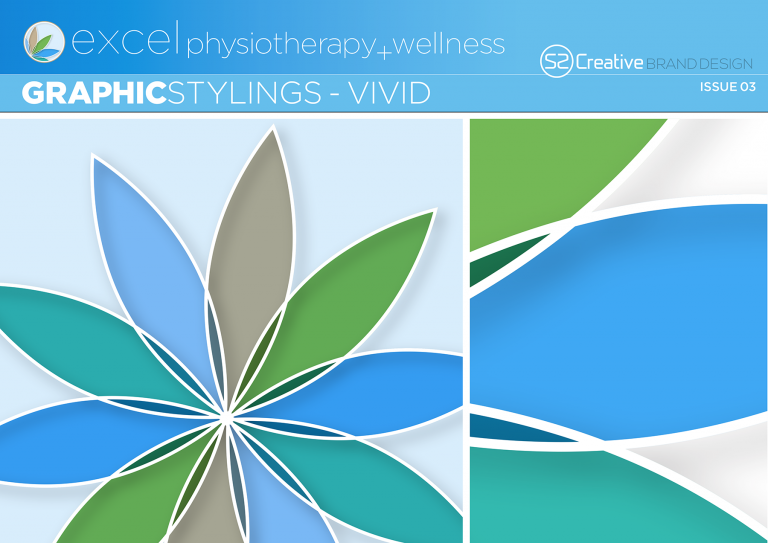
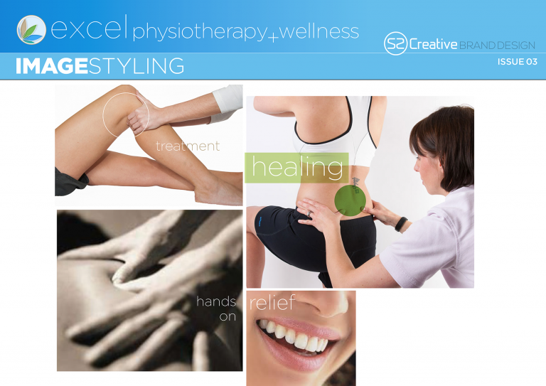
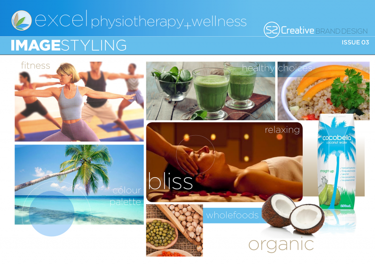
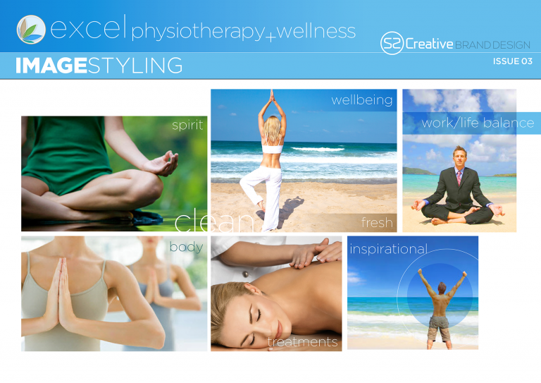
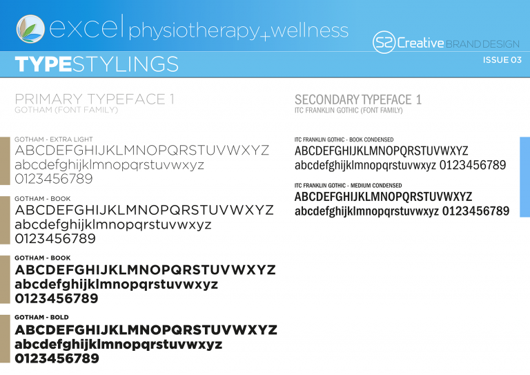
With the logo finalised, we then worked on developing a Look and Feel. We do this with most of our projects, developing associated graphics, elements, type selections and treatments, image treatments, colour palettes to bring together a representation of the company beyond the logo mark.
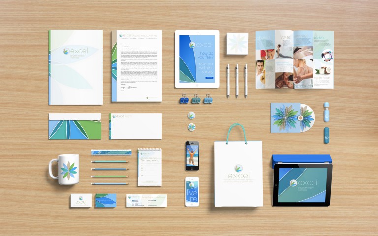
A Look and feel document is prepared like a toolkit for the various applications required, all with an emphasis on client driven priorities across print and digital mediums. We then applied our creative to:
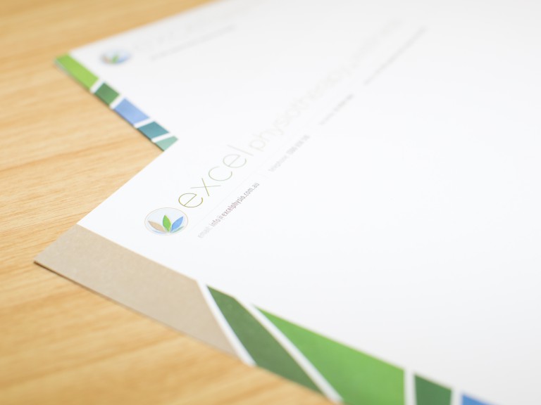
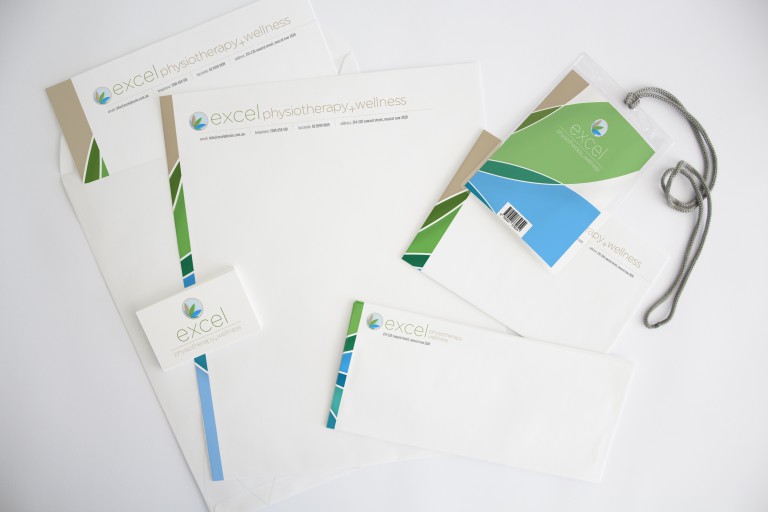
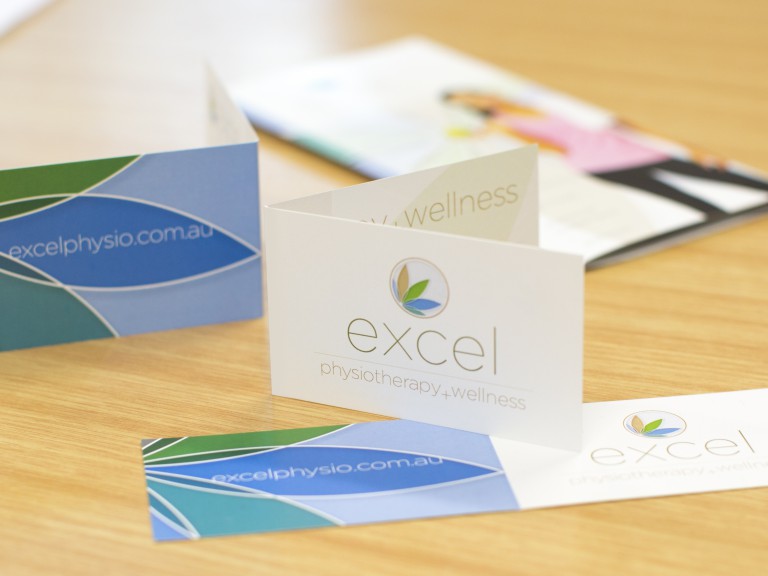
Stationery – Letterhead, business cards, with com slips referral pads
Brochures and launch flyers
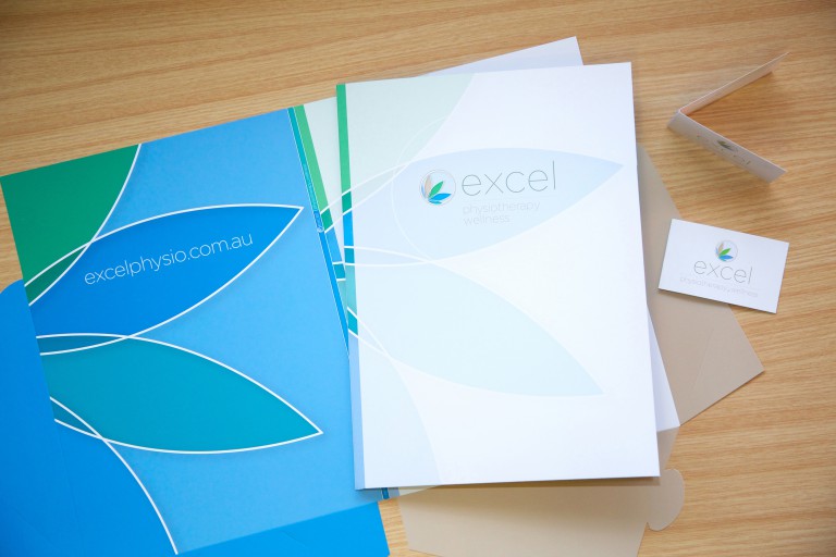
Client Presentation Folders
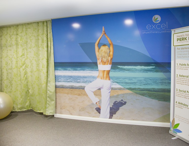
Exterior street-front Signage, interior mural
EXTERIOR SIGNAGE
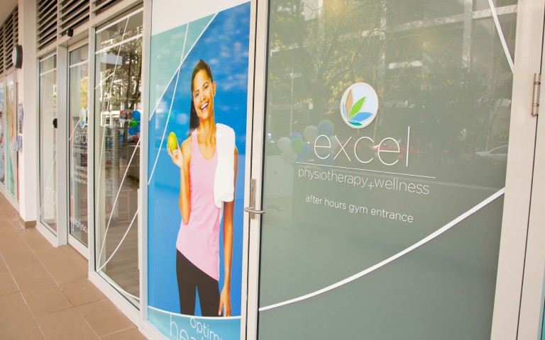
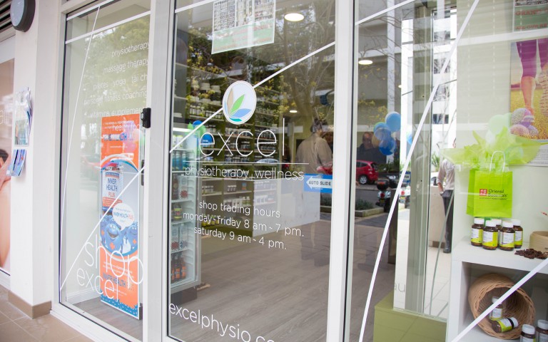
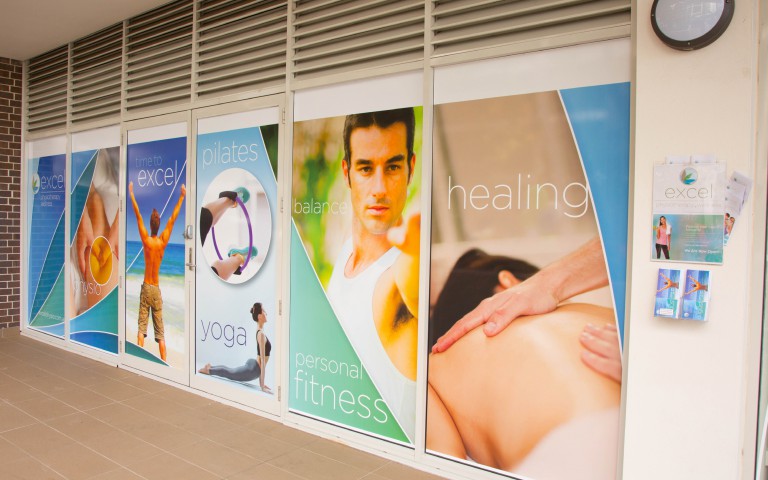
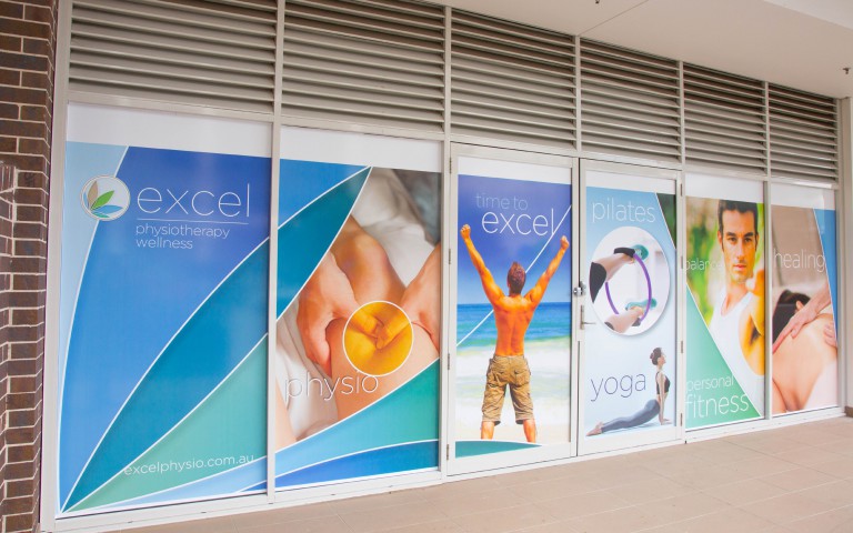
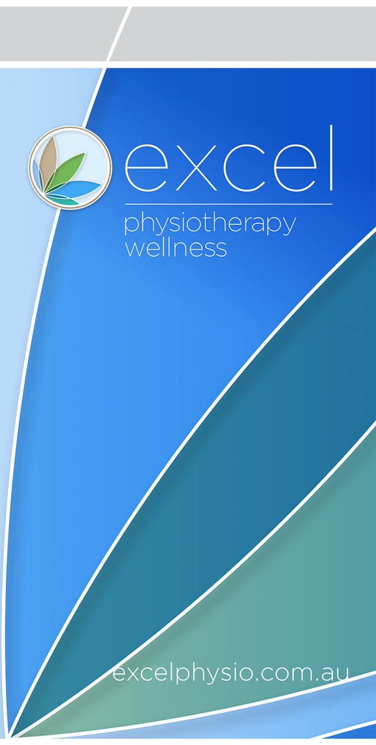
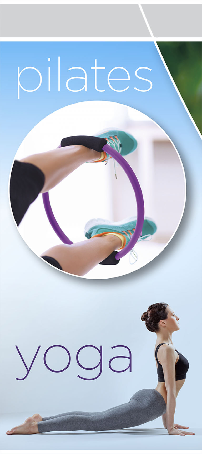
We developed the design based on the Look & Feel we had already established with their Brand Story. Comprising of over 12 x 1.2 metre wide window panels, it proved a great opportunity to maximise their brand at street level. We were keen to create a single presence, continuing the design across the whole expanse to unify the space rather than treat each window separately. The health food shop was situated centrally beyond the treatment rooms to the left. We wanted to use the retail space to draw in browsers and so kept these windows clear, continuing the white keylines across the glass.
DELIVERABLES FOR THIS PROJECT:
- June 12, 2015
- Case Studies

